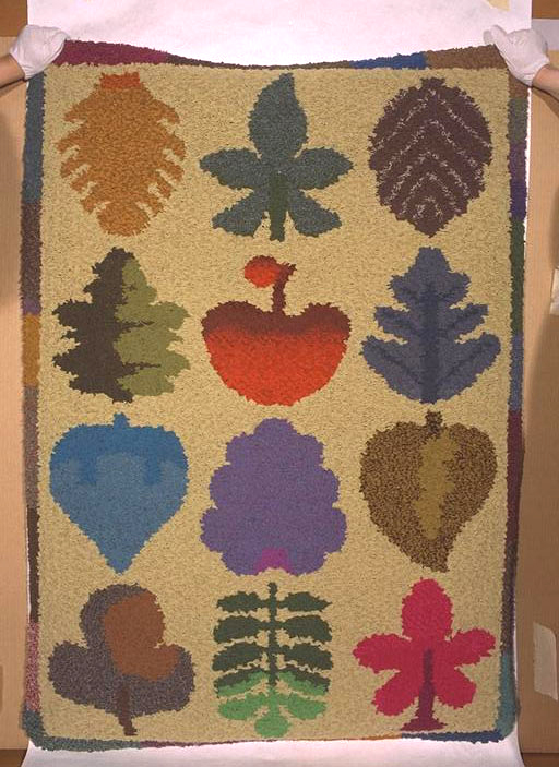
Beatrice Cross, *Life is Sweet* (c 1994), rags, hessian. Collection of The Dowse Art Museum, purchased 1995

Neil Dawson, *Enclosure* (1978), nickel plated stainless steel, piano wire, nylon mesh. Collection of The Dowse Art Museum, purchased 1979.
The Dowse Art Museum is a home for objects and their histories. When I began researching our collection, with homes, houses and their occupants in mind, a plethora of works popped up as the result of random keywords from the collection server’s slow but wilful motors: home, house, interior, domestic, family, life, roof, day, window.
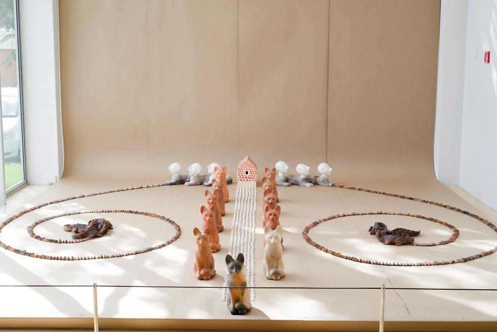
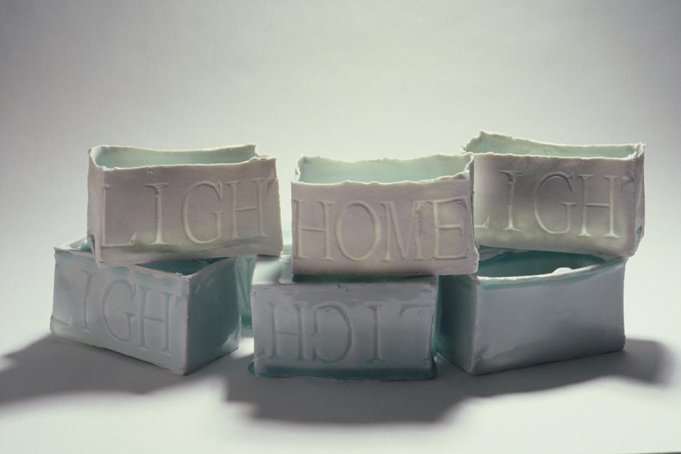
Out spits Neil Dawsons’ Enclosure, Enlargement and Rotation (all 1978), Sonny Broughton’s The House of Dowse (1999), Raewyn Atkinson’s Home Light (2001–2002) and Bronwynne Cornish’s Home Is Where The Heart Is (1982).
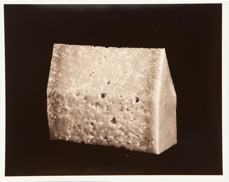
Artists have always used their surroundings as points of departure, whether it be their studios, their cities or towns, their families and their homes. Peeling through The Dowse Collection, three artworks about the house have drawn my attention: Marie Shannon’s The House of Parmesan (c.1991), Pauline Bern’s The Order of the Domestic Order (2000) and Beatrice Cross’ Life is Sweet (c.1994).
Marie Shannon’s work is intimately intertwined with her domestic environment; her professional oeuvre is a product of her private experience, the spaces she occupies and the people she shares her life with. Working with photography and video and often appearing to be documentative in quality, Shannon’s work poses as a constructed reality and questions the notion of documentary.
The House of Parmesan presents a house-like form in a black and white photograph. It reminds me of my childhood church standing lonesome in a barren paddock on the side of a rural Canterbury road. With the steep pitch of the roof and the narrow body of the ‘house’, it could equally be a modernist home, standing proudly on its barren land. Of course, it’s not a photograph of a home, but of a sculptural form made of parmesan cheese. As I’ve looked at this image for days, I keep wondering if it’s been cut to shape for the photograph or the shape is a product of clever use, diagonally shaved over bowls of pasta so that the last shave won’t endanger the end of your fingers.
The image has a defined shape, and yet the porous parmesan surface that we know could be crumbly makes me think of the porous, crumbly nature of the homes we’re bound to. Spaces that comfort and soothe, but, equally, spaces that have holes in them; an inherent fragility, not always taken into account when all we’re interested in is being warm and embraced by their kinder qualities.
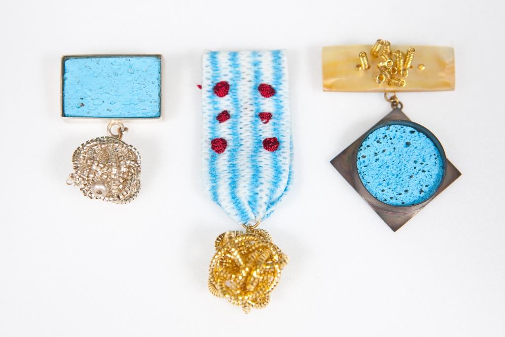
I’ve thought a lot about how many people are due to join The Order of Domestic Order, if it were a thing, how many people would have this honour. Pauline Bern’s The Order of Domestic Order is made of three medals, taking the form of military medals typically won for bravery, courage or honour in the face of wartime danger—but seemingly made with a blue Chux cloth and sponge, balls of ‘Goldilocks’ and what could be the last of a well-used Sunlight soap bar. The materials are, in fact, a mother-of-pearl bar adorned with gold springs, with the medal made from oxidised silver and 'Chux Multi-Cloth' cloth, embroidered with red thread and a 18ct gold 'Goldilocks' scrubber hanging from the bottom, and a pumice painted blue to look like a cleaning sponge with a silver border, and a silver 'Goldilocks' type scrubber hanging from it. Except for the Chux, there is nothing domestic about these materials at all.
In the exhibition catalogue alongside Bern’s 2000 exhibition, ‘Strain, Grate, Whisk, Scrub: jewellery by Pauline Bern’, Douglas Lloyd Jenkins notes that The Order of Domestic Order are awards for those who’ve persevered in the face of drudgery. My grandmother, who knows more than a thing or two about drudgery, was due to move into a retirement village the day we began lockdown. Crippled with arthritis, and pumped with prednisone, she can’t be kept down, never has been nor will be. She called me to tell me she’d just finished re-painting her outdoor garden sculptures the other day (gnomes, horses, bird baths and various small animals) because she couldn’t think of another home chore that needed doing. Bern’s work is a wry, somewhat depressing, joke for women, although not exclusively. It’s a perfectly crafted acknowledgement of the mundanity of housework and a humorous comment on where we place our significance when adoring and celebrating honourable accomplishment.
I have spent untold hours lying aimlessly on the floor over the last three weeks. I try to claim it’s meditating, but, alongside boredom and procrastination, it’s mostly anxiety that drags me, literally, downwards. I feel that when I’m spread over the floor, I’m reminded that at any point in time I can get back up and continue doing what I was doing, or choose something else to do and that really, I have little to be down about. Life is Sweet, by Beatrice Cross has become a favourite collection item while I’ve been researching from my computer. I haven’t seen it in real life yet. It’s an average (1420 x 1015 mm) size floor rug, cream with a coloured border and 12 colourful organic shapes (they’re leaves but really two of them could be fruits) in a 4x3 grid across its face.
There is very little information online about Cross, other than a short text via Objectspace’s archive and homestolove.com, which is the best place to see examples of Cross’s work, in the home of her granddaughter, Lily Richards. According to her daughter, Cross began making rugs to cover her bare, white tiled floors, taking inspiration from the plans of a Frank Lloyd Wright house—this turned into a 25-year career in rug making. Using the offcuts from her family-owned fashion boutique on Auckland’s Queen Street, and those found in second hand stores, Cross elevated the common craft of rag rugs to contemporary textile making, seeing her works as paintings for the floor, rather than for walls.
Life is Sweet, a colourful, hidden gem in The Dowse Collection, although made for the floor, has pulled me off it. I can’t work out if the shapes are leaves or fruit and as I’ve done my daily run, I’ve photographed leaves to check against the image of the work. I’m no green-thumb, but one shape appears to be a clover while the other looks like the plump leaves of a kowhai; the fruits I swear are grapes and an apple. Cross’s work is a reminder, for me, of how sweet my life is—that I can get up off the floor, out of my house and onto a track lined with foliage I know little about—that I can, like Cross, take my time to learn these things, as she did with the slow resourcefulness and thoughtful nature she gave to her floor paintings.